INDUSTRY:
FILM
YEAR:
2025
EXPERIENCE:
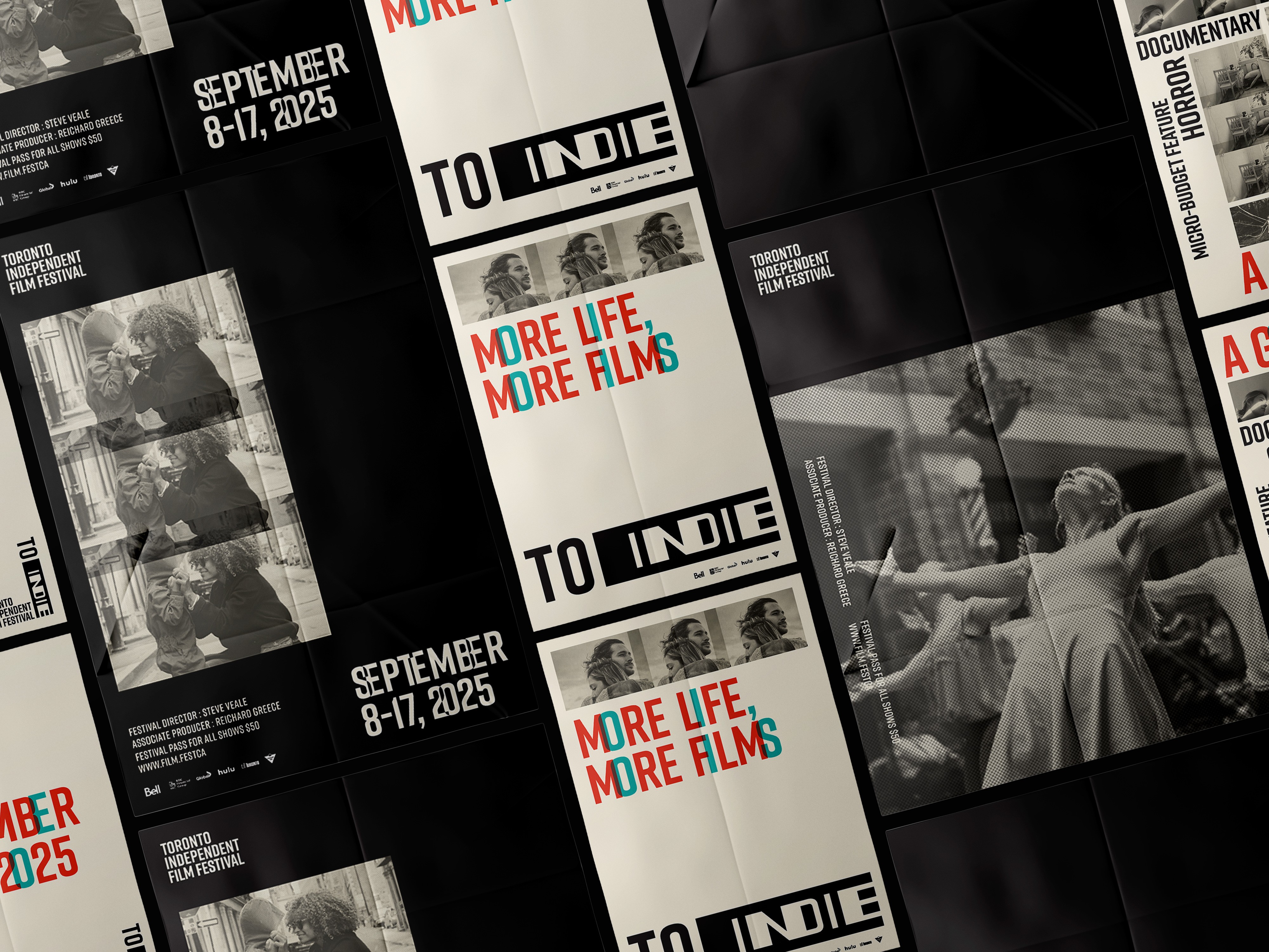
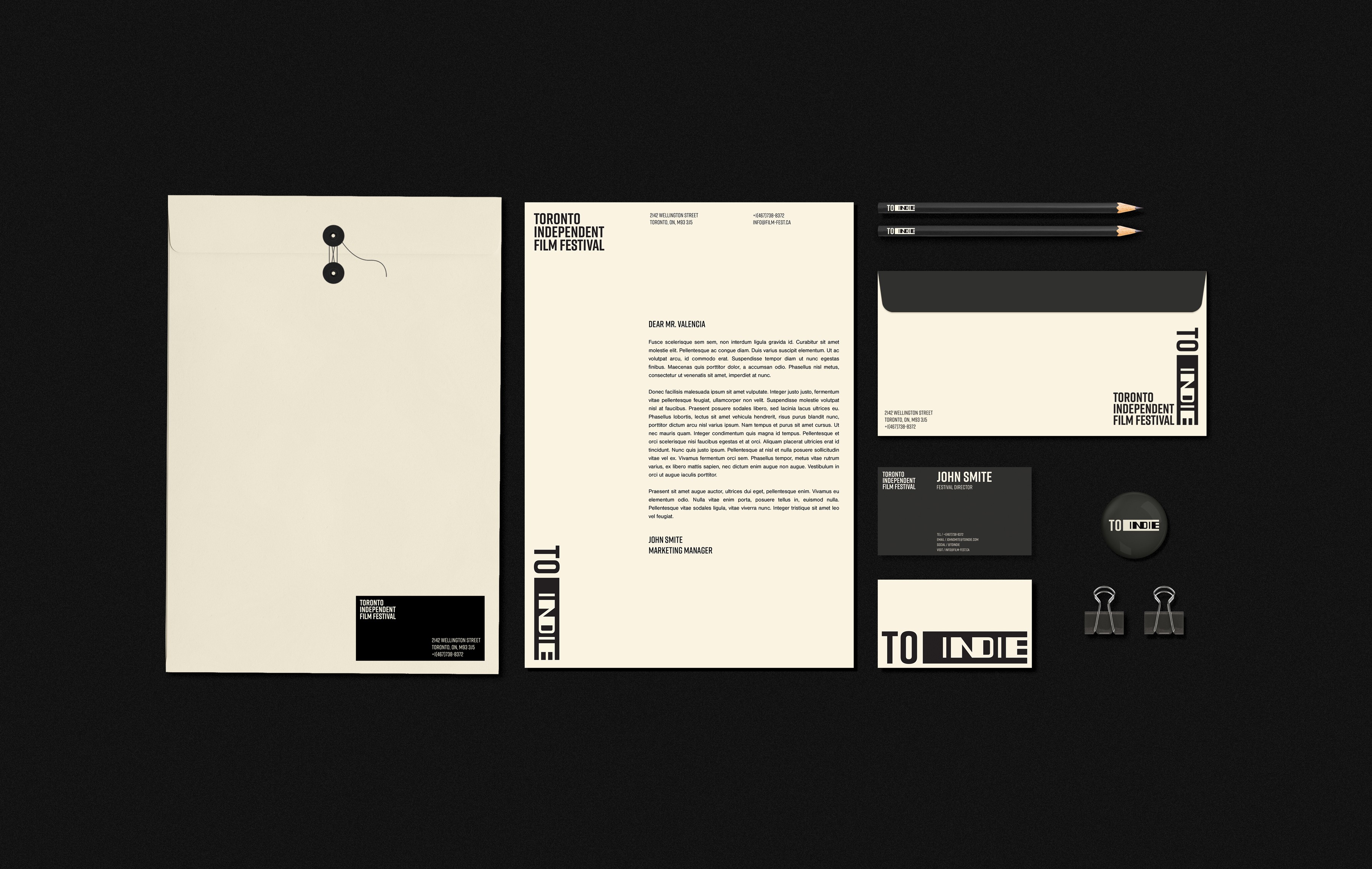
Visual Identity, Logo Design, Print Collateral
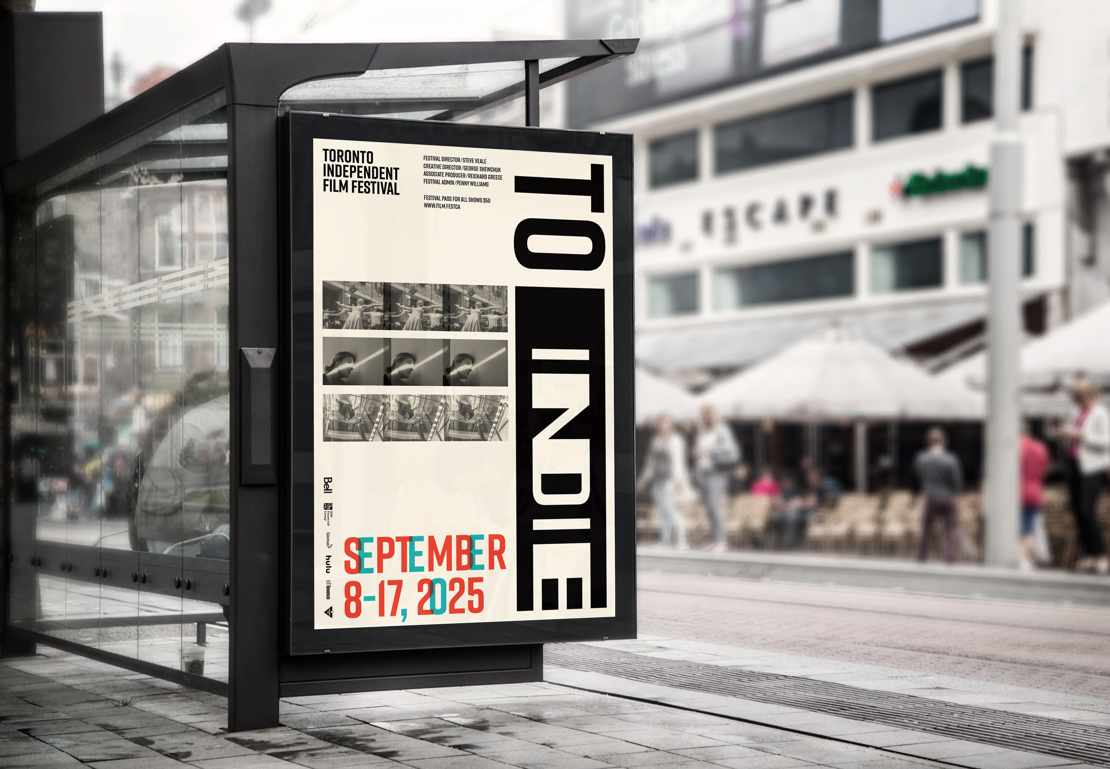
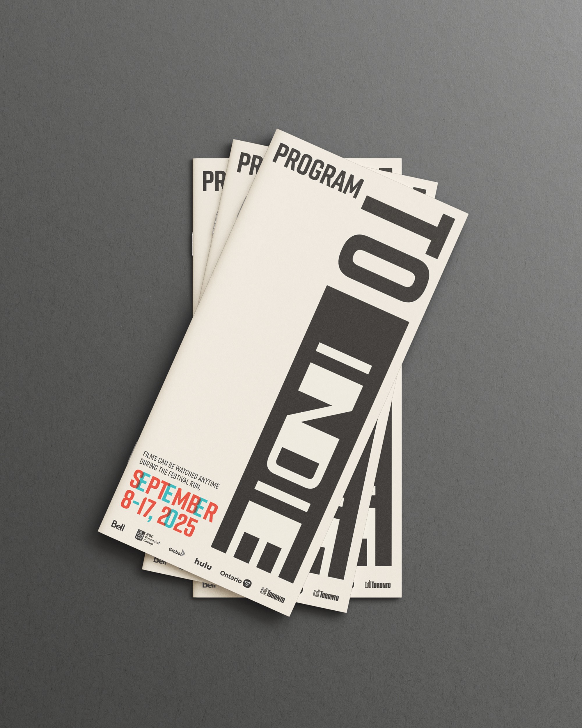
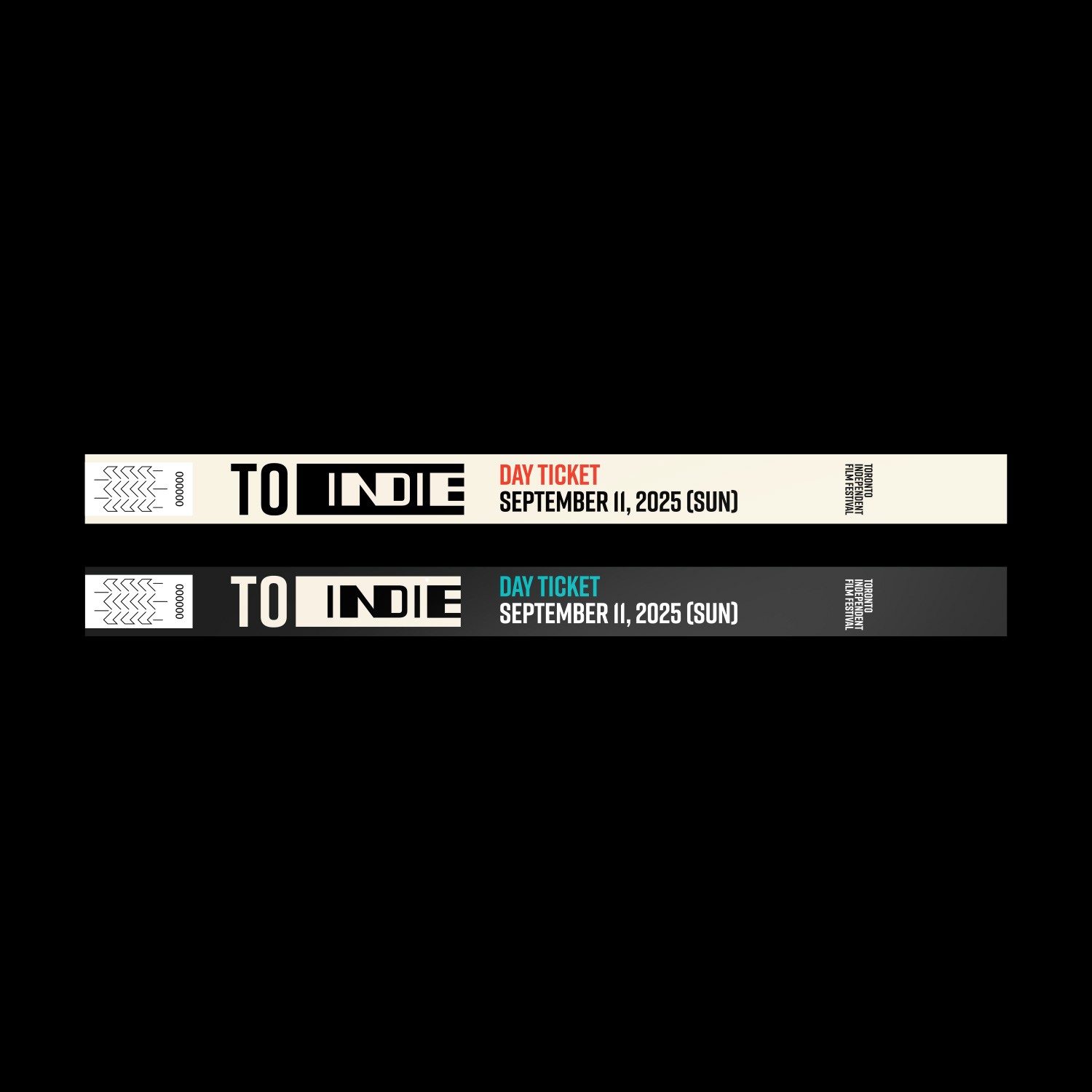
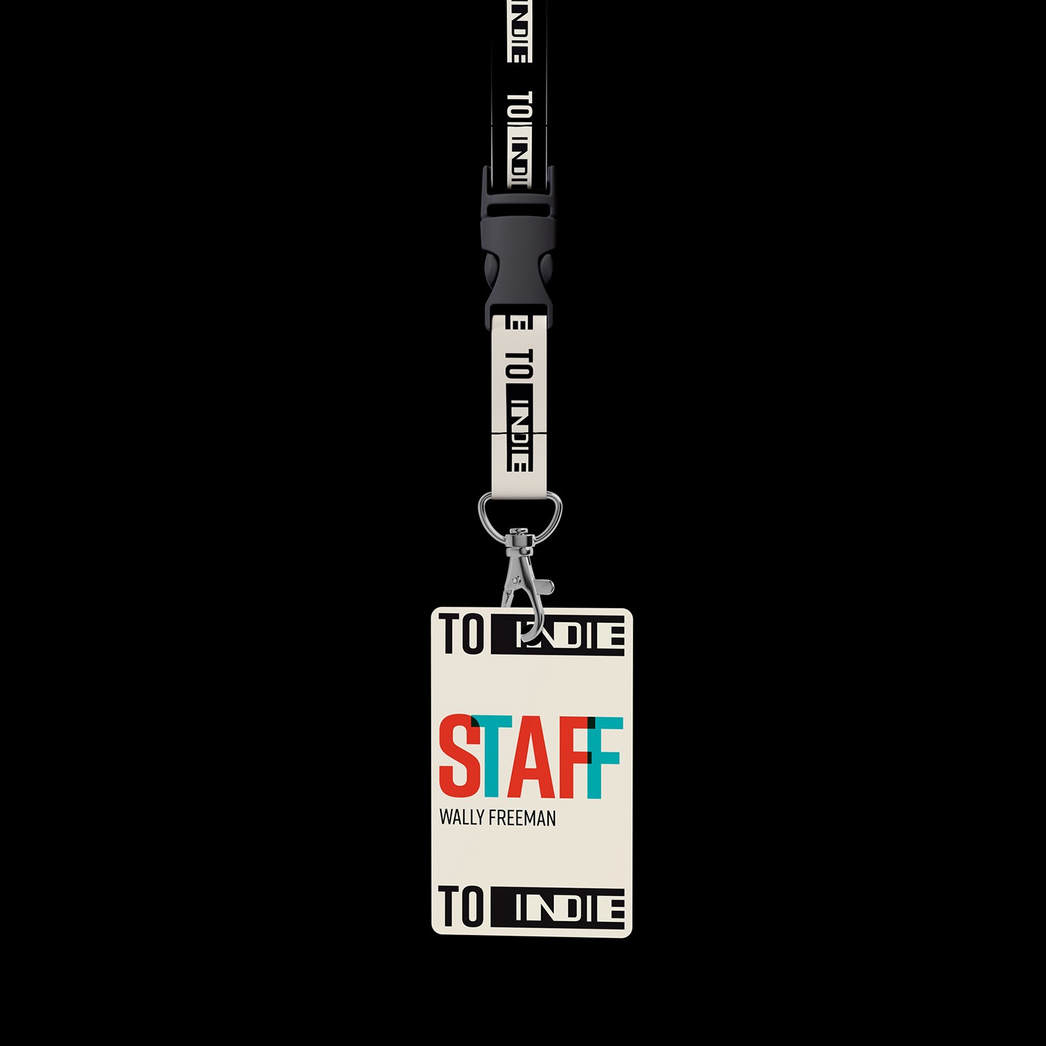
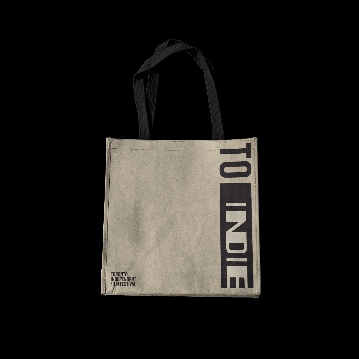
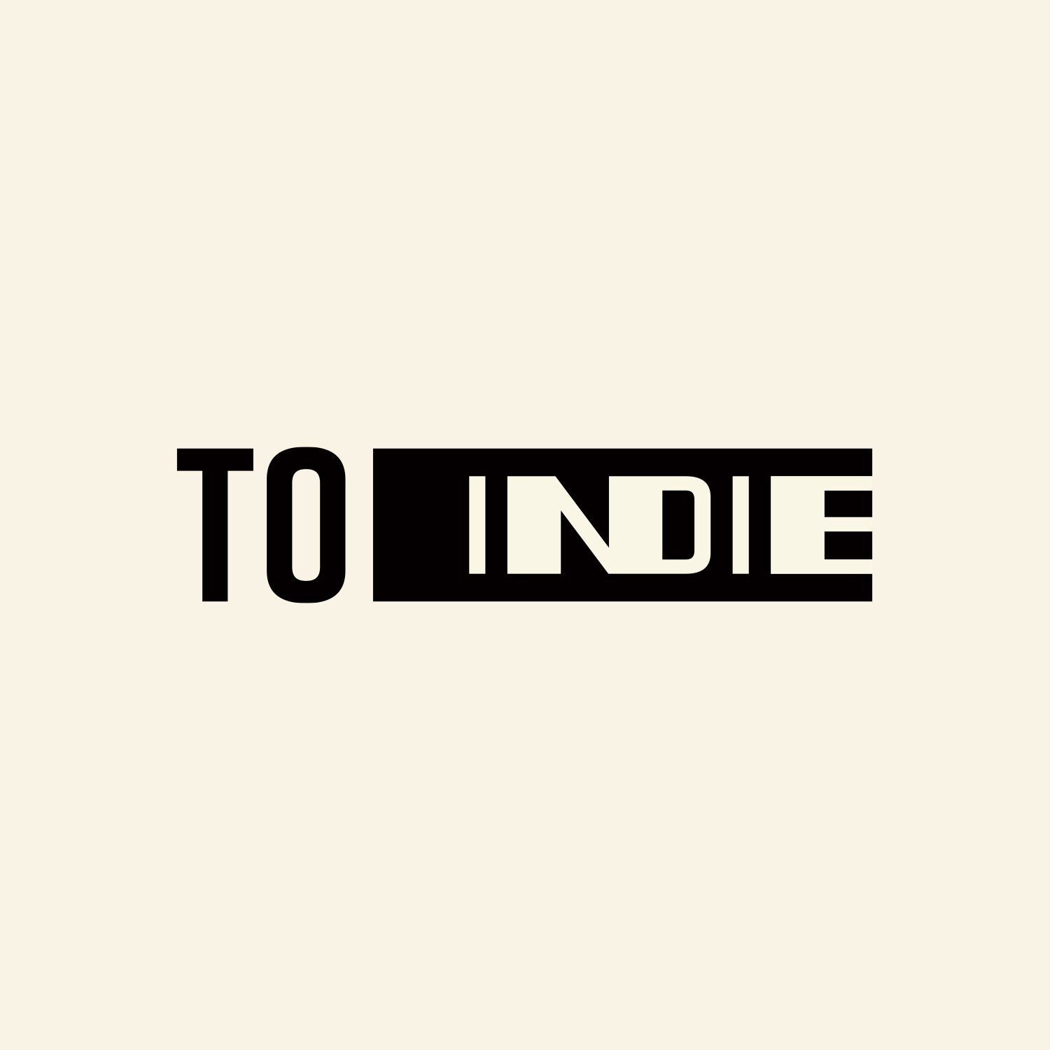
TO INDIE
about.
TO indie is a Toronto-based organization celebrating independent filmmaking, best known for its annual festival spotlighting micro and no-budget films.
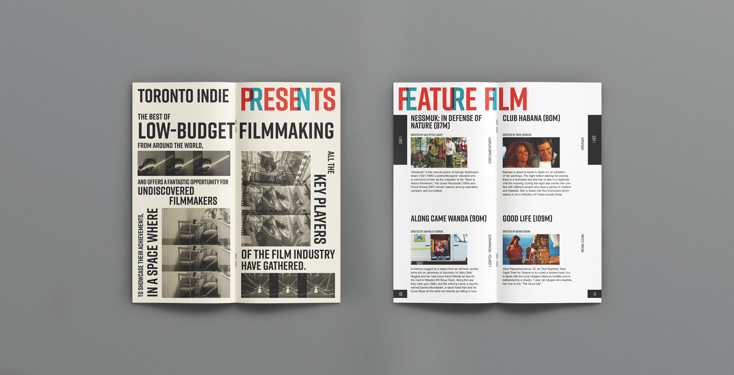
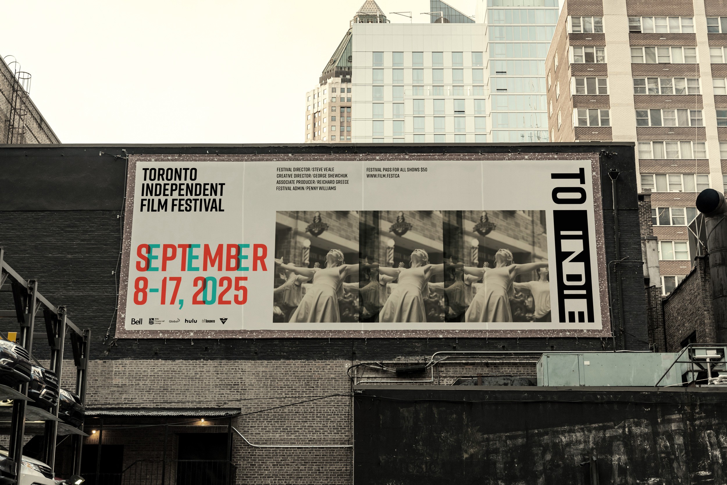
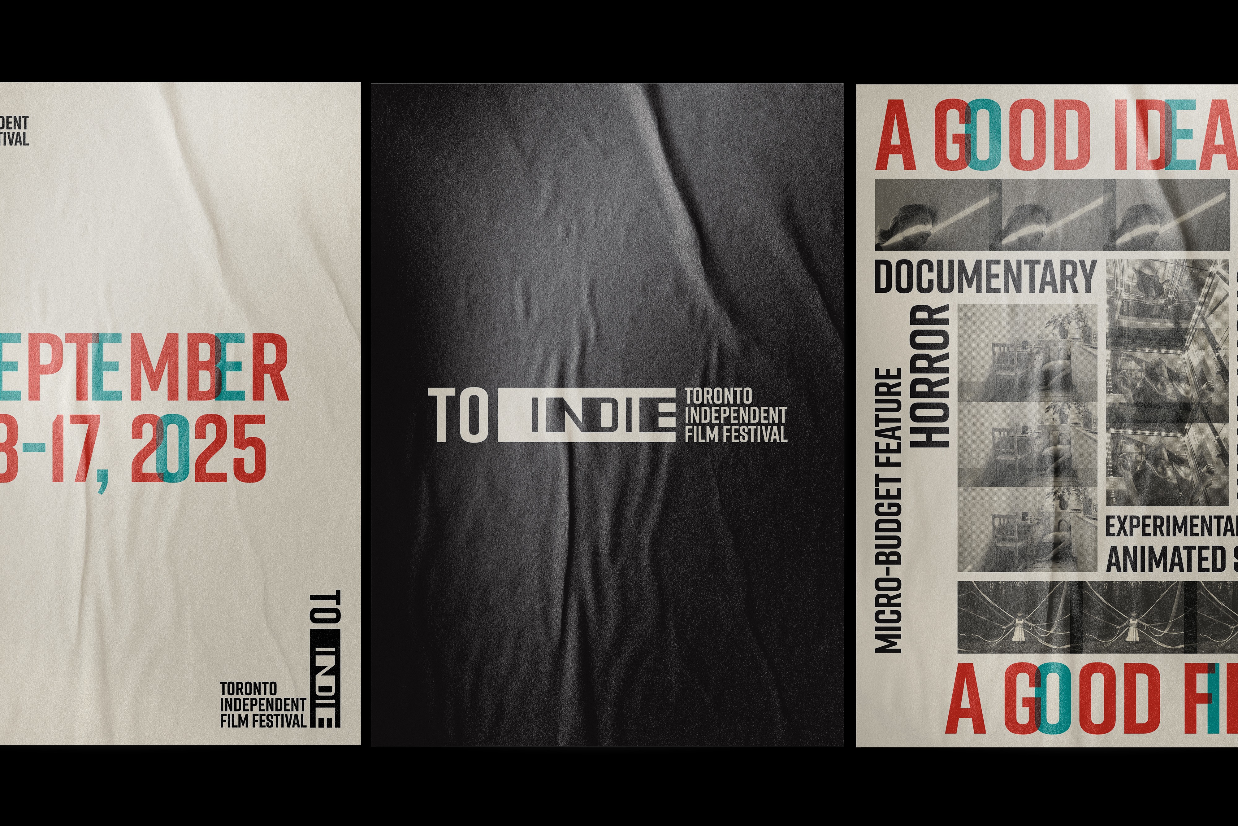
This rebranding project aimed to refresh its outdated identity and reaffirm its place as one of North America’s top indie film festivals. The rebrand presents TO indie as a forward-thinking and dynamic platform, reflecting the creativity and aspirations of emerging filmmakers in a contemporary visual language.

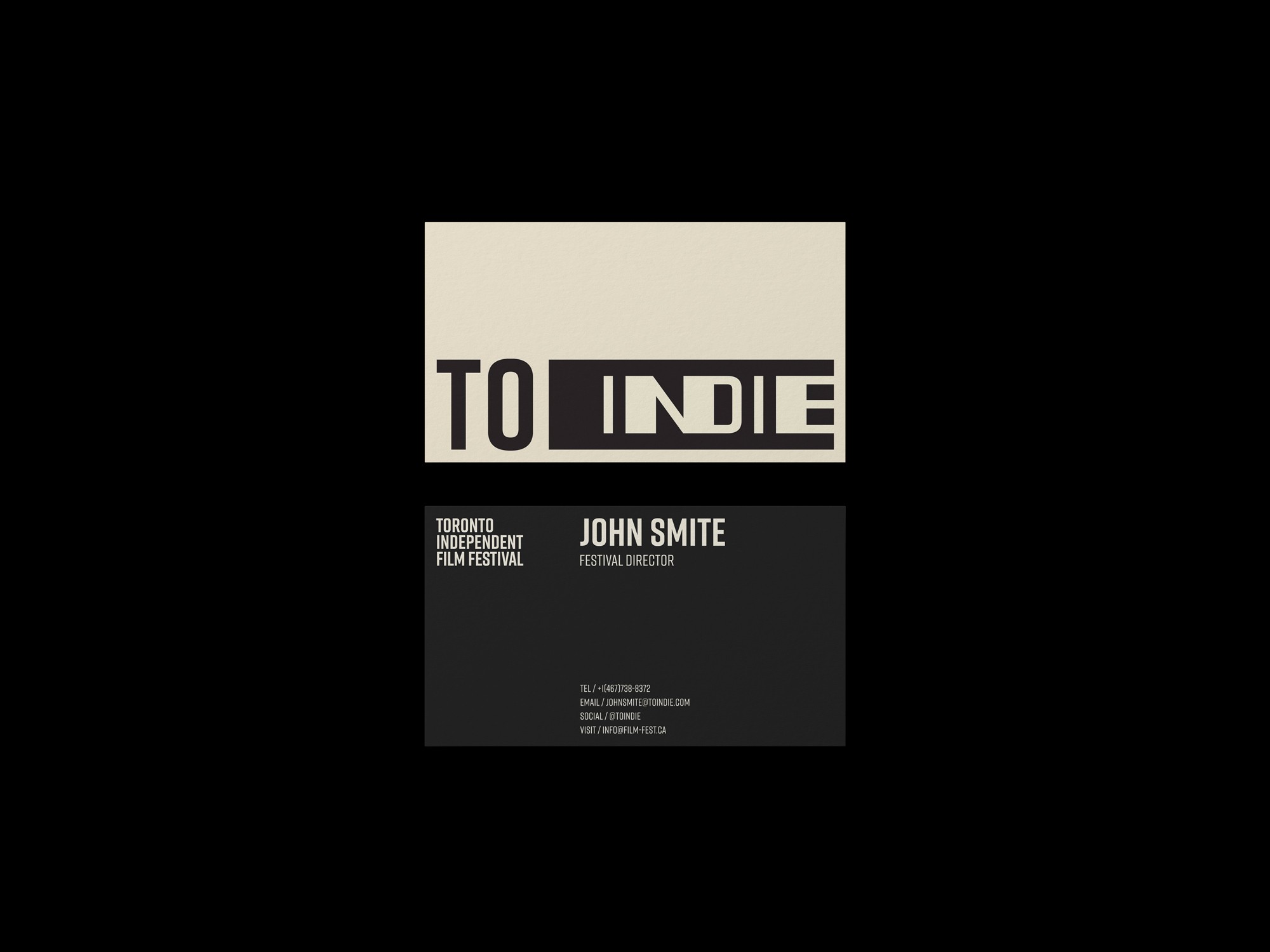
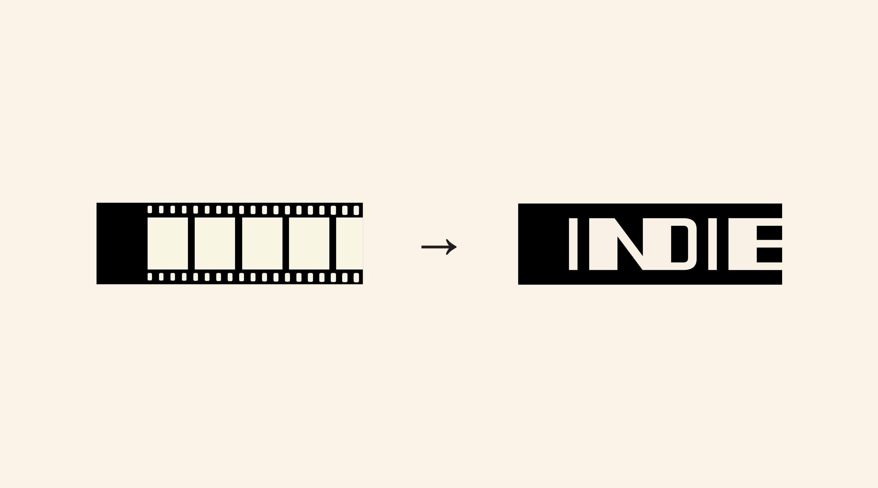
logo.
The "INDIE" icon presents the silhouette of cinema film tape. While it evokes feelings of nostalgia, combining with clean and bold sans serif makes just the right balance to complement the modernity in traditional element.


visual direction.
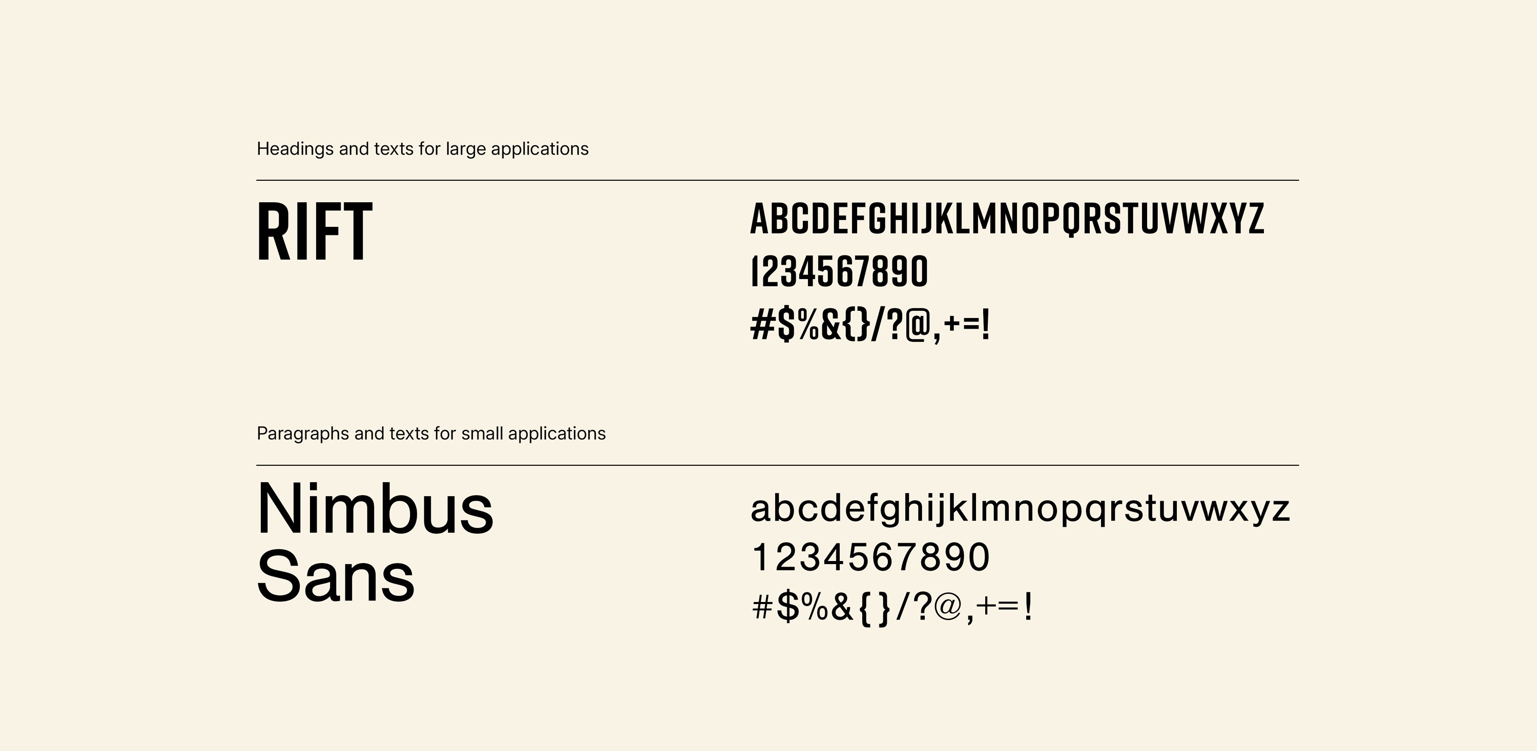
Visual direction centers on a modern and youthful tone, using Rift for its confident character and pairing it with Nimbus Sans for clarity and readability. Inspired by disruptive layouts and visual effects, the mood board conveys creative freedom aimed at younger audiences. A retro-infused palette of orange and green adds a cheerful, expressive energy to the brand.